Jrzee Rentals.
Happy Moves.™
The Client
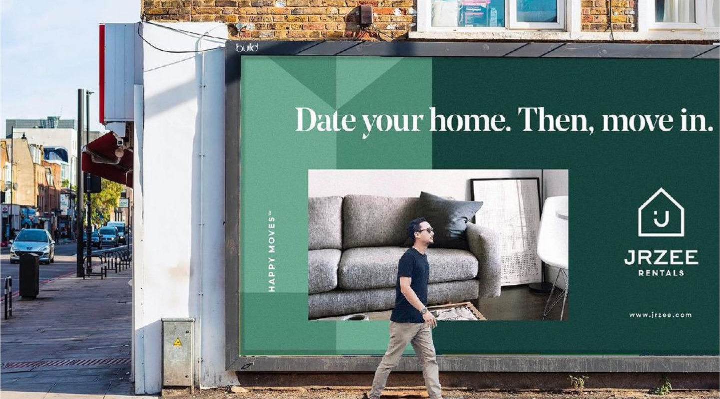
A real estate entity with a customer centric approach, Jrzee merged hip with happiness.
The Approach
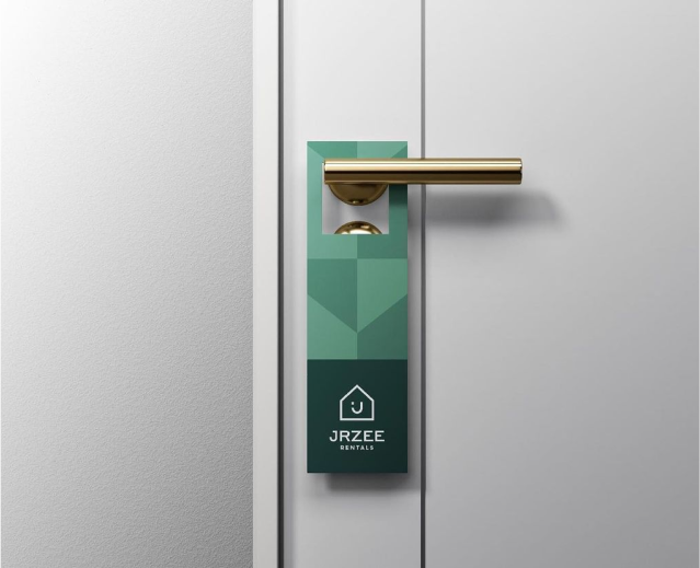
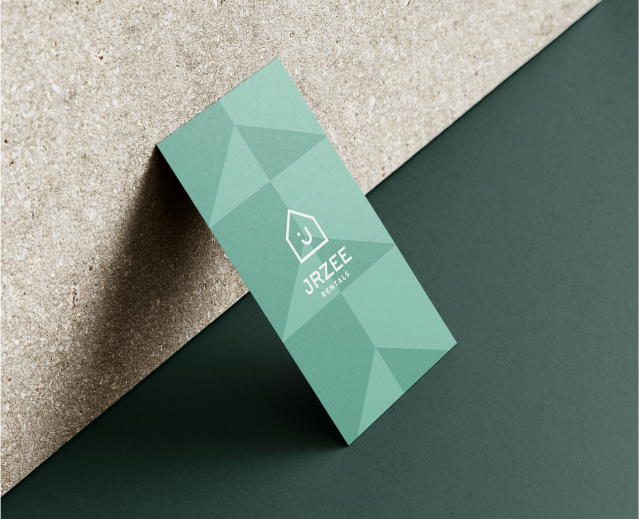
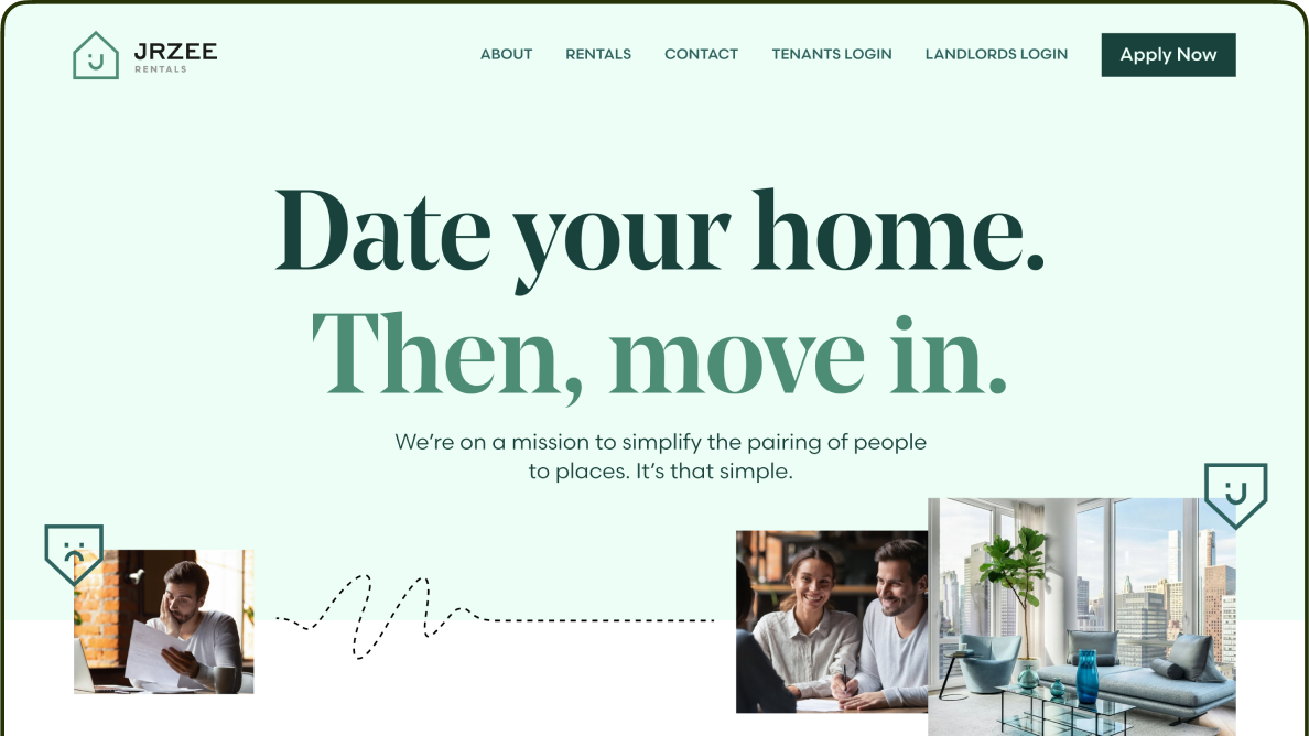
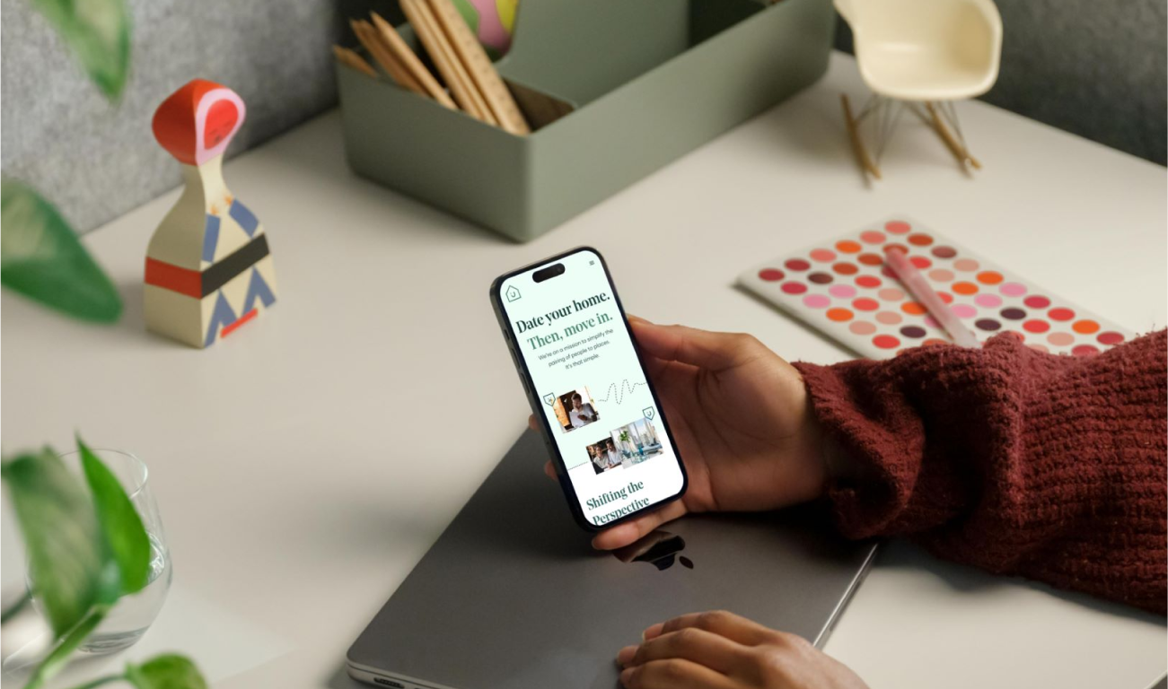
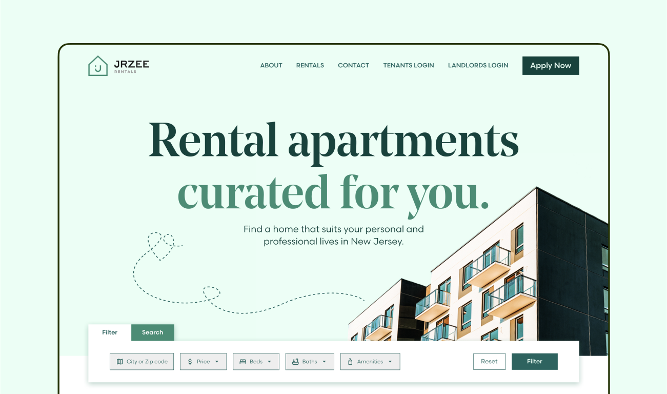
When Jrzee approached us, they had a vision to uphold a tenant friendly stance with a forward thinking business model. From naming to branding, the crisp emergence of this modern day apartment hub came to life, later channeling into a website, print materials, office signage and a user portal that would make every apartment search smart and seamless.
Project Type
Art direction, Copywriting, Brand identity, Web UI/UX,
Web Development.


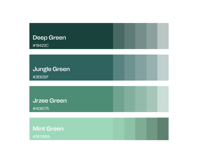
Palettes took on a new dimension at Jrzee, with the green tones symbolizing transactional fluidity and hospitality ambiance. We chose a hue that would further embed a modern nod to the brand on multiple levels.
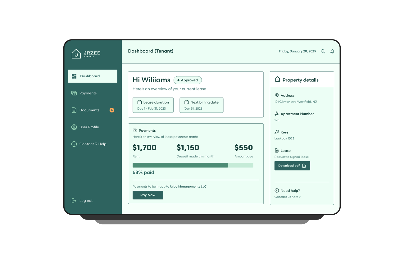
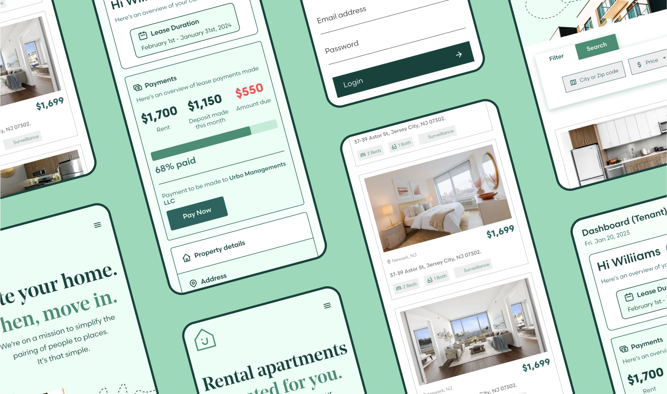
We placed great attention to detail when developing the portal back end, mimicking Steve Jobs’ vision of ‘the back of the fence being as beautiful as the front’.

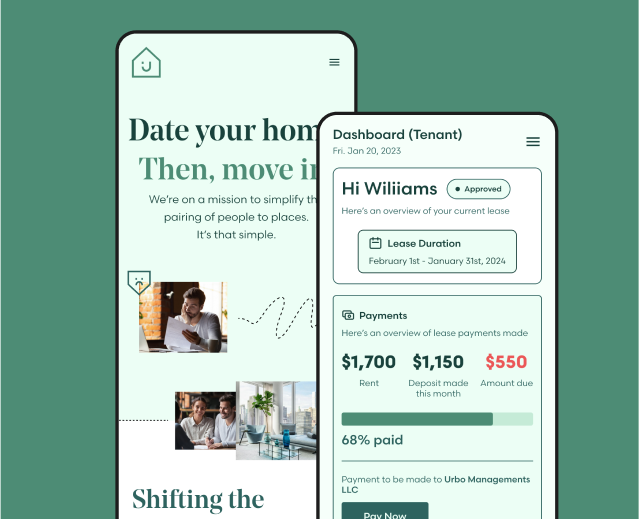
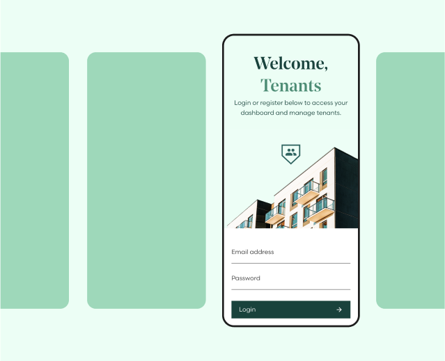
A deeper delve inside our tenant portal.
Client says:
